A depth chart is a tool for understanding the supply and demand of Bitcoin at a given moment for a range of prices. It is a visual representation of an order book, which is the outstanding buy or sell orders of an asset at varying price levels. For those looking to engage in trading, knowing how to read a Bitcoin depth chart is an essential part of understanding the market.
The components of a depth chart
In order to read a depth chart, it’s important to understand the components of the chart. While depth charts can vary across exchanges, a standard Bitcoin depth chart has a few key components:
- Bid line. The bid line depicts the cumulative value of the bids, or buy orders, at a given Bitcoin price point. It is represented by a green line sloping negatively from left to right. Buy orders are placed in dollars, or other fiat currency.
- Ask line. The ask line represents the cumulative value of the asks, or sell orders, at each price point. It is shown by a red line sloping negatively from right to left. Sell orders are placed in bitcoin.
- Horizontal axis. The price points at which buy and sell orders are being placed.
- Vertical axis. The aggregate dollar value of all bitcoin sell orders placed. The total dollar value of all buy orders is represented on the left vertical axis

Most cryptocurrency exchanges provide depth charts where users can hover over any point on the bid or ask line and see how many buy or sell orders are placed at that price.
What is represented by a depth chart?
In a depth chart, the aggregate value of the sell orders is stretched to correspond to the dollar values on the left axis. However, the values of the x-axis’, while denominated in the same currency, do not always show equal values. The difference in the values on the x-axis’ gives an investor or trader insight into the liquidity and volatility of the asset.
If demand and supply for the asset are roughly equal, then the x-axis should be closely aligned in value. If the asset is very liquid, meaning more market participants are looking to sell the asset than are looking to buy, volume will be skewed to the right, creating a large sell wall. If the asset is illiquid, in which there is higher demand for the asset than participants are willing to supply, the chart will be skewed to the left, creating a buy wall.
Buy and sell walls
Buy and sell walls indicate a significant volume of orders at a given price, and can indicate market trends. Buy and sell walls are indicators of future weighted orders and volatility. The buy and sell walls listed in a depth chart can give a trader insights into how the other actors in the market are predicting price changes. Large buy and sell walls can be created by a single trader or market maker placing a large order.
Buy walls
The more unrealized buy orders exist at a given price, the higher the buy wall. A high buy wall can indicate that traders believe the price will not fall below a certain price. A large buy wall prevents bitcoin prices from dropping rapidly because it creates a large amount of buy orders at one price. During a bearish market cycle, buy wall orders may be filled more rapidly than during bullish market cycles due to increased market liquidity. The creation and growth of a buy wall can be influenced by market psychology. If traders see a large or growing buy wall, they may believe that the asset price will rise, influencing them to sell and generate immediate profit or buy and realize greater long-term profits.

Sell walls
The more unrealized sell orders exist at a given price, the higher the sell wall. A high sell wall can indicate that many traders do not believe an asset will surpass a given price, while a low sell wall may signal that the asset price is expected to rise. A large sell wall prevents bitcoin prices from rising rapidly because it creates a large amount of sell orders at one price. If traders see a large or growing sell wall, they may believe that the asset price will fall, influencing them to sell and avoid greater losses.

Candlestick charts
Cryptocurrency exchanges will often provide a second chart, known as a candlestick chart, along with a depth chart. A candlestick chart illustrates the price movements of an asset during a specified timeframe. A candlestick chart, also known as a price chart, uses candlestick figures to represent the changes in price between open, close, high, and low.
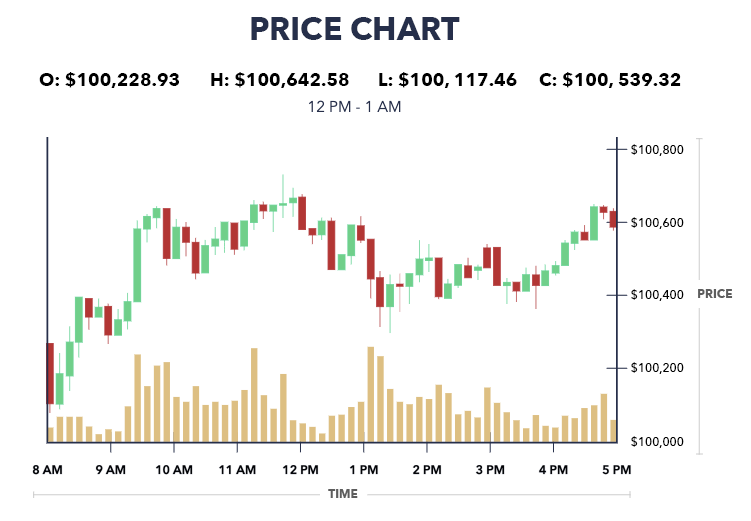
Candlestick charts can be viewed in almost any fixed time period; many day-traders will keep track of minute-by-minute price movements. A candlestick chart doesn’t include information about liquidity or total volume in the same way that a depth chart does, but it provides useful information about how others in the market view the asset and are anticipating bullish or bearish price movements.
The main component of a candlestick chart is the candlestick body, which represents the price movement during the fixed time period. The widest part of the candlestick is known as the “real body”, and illustrates the dollar difference between the opening price and the closing price. The thin, upper end of the candle “wick” shows the high price of the time frame, and the thin, lower end of the wick represents the low price.
Candlesticks are often colored green or red; a green candlestick means that the price rose over that period, while a red candlestick indicates that the price fell over that period.
Conclusion
The bid and ask lines represent the cumulative value of all buy orders or sell orders at a given price, so depth charts provide good insight into the supply and demand of Bitcoin at present, as well as how others may be anticipating prices to fluctuate in the near future. When reading a depth chart, it’s important to consider the impact of hidden liquidity. The term hidden liquidity refers to pending buy or sell offers that have not been factored into the depth chart. This can impact the accuracy of the depth chart.
Key Takeaways
- A depth chart is useful for understanding the supply and demand for bitcoin at various prices.
- Bitcoin supply is quantified in bitcoins and demand is quantified in dollars.
- Depth charts can be viewed and interacted with on most exchange sites.